
Professional Menu Design Services
August 3, 2026Restaurant Menu Design Singapore:
A Complete Guide for Restaurant Owners
Table of contents
- Restaurant Menu Design Singapore: A Complete Guide for Restaurant Owners
- 1. Before we talk about fonts and colours, let's talk about your restaurant
- 2. A beautiful menu is great. A menu people can actually read is even better.
- 3. Choosing the right fonts: because not every pretty font is meant for every job
- 4. Colour: you don't have to use red and black just because you serve Japanese food
- 5. Food photography: should every dish have a photo?
- 6. Writing dish descriptions: make customers hungry, not sleepy
- 7. How many pages should your restaurant menu have?
- 8. Pricing: make it easy for customers to find what they're looking for
- 9. Printed menu vs digital menu: which should you choose?
- 10. Using AI to Design Your Restaurant Menu: What Are the Limitations?
- 11. Before printing: a few things worth checking
- 12. When should you redesign your restaurant menu?
- 13. So, what actually makes a good restaurant menu?
- Looking for restaurant menu design in Singapore?
- Frequently Asked Questions About Restaurant Menu Design
- Ready to give your restaurant menu a refresh?
- My final recommendations before this goes live
Let's be honest. When you're running a restaurant, designing the menu is probably just one of about 57 things on your to-do list.
You've got ingredients to order, staff to manage, suppliers to chase, customers to look after and approximately a million other things that need your attention. And somewhere in between all that, you're supposed to create a menu that looks beautiful, reflects your brand and makes people hungry just by looking at it.
No pressure, right?
But here's the thing: your menu is often one of the first proper interactions customers have with your food. Before they've tasted your signature dish or fallen in love with your house-made sauce, they're looking at your menu and deciding what to order.
A good menu makes that experience easy and enjoyable. It helps customers understand what you offer, discover dishes they might love and get a feel for your restaurant's personality.
A poorly designed one? Well, let's just say that even the most delicious food deserves better than tiny text, blurry photos and prices hiding somewhere in the corner.
I'm Rei, and I've spent years working on graphic design projects for restaurants and F&B brands. Over time, I've learnt that good restaurant menu design isn't just about making things look pretty. It's about making the menu work for the restaurant and the people using it.
So, if you're opening a new restaurant, refreshing your existing menu or simply wondering whether it's time to give your current one some attention, let me walk you through what I consider when designing a restaurant menu in Singapore.
1. Before we talk about fonts and colours, let's talk about your restaurant
I know, I know. You came here to talk about menu design, and I've already started asking questions!
But bear with me. This part really matters.
Imagine designing a menu for a casual Japanese eatery and using exactly the same visual approach as a high-end omakase restaurant. Both serve Japanese food, but the experience they're offering customers is completely different.
One might need a menu that's straightforward, approachable and easy to browse during a quick lunch. The other might call for something more restrained and considered, where every detail contributes to the dining experience.
Neither is better than the other. They simply have different personalities.
Before I start designing, I want to understand a few things:
- Who are your customers?
- What kind of dining experience are you trying to create?
- What makes your restaurant different from the one down the street?
- Is your brand casual, playful, traditional, modern or more premium?
- What do you want customers to remember about your restaurant?
These answers help shape everything from the typography and colour palette to the menu format and choice of materials.
For example, if your restaurant has a beautiful, contemporary interior but your menu looks as though it belongs to an entirely different establishment, something may feel a little disconnected.
Your menu doesn't have to match your interior down to the last detail, of course. But it should feel like it belongs to the same family.
Think of your menu as part of your restaurant's overall personality. Your logo, interior, menu, packaging and social media don't need to be identical twins, but they should at least look as though they know each other.
2. A beautiful menu is great. A menu people can actually read is even better.
Have you ever opened a menu and found yourself squinting at the text, tilting the page towards the light and wondering whether you need to borrow someone's reading glasses?
Not exactly the most relaxing start to a meal.
One of the biggest things I consider in restaurant menu design is readability. A menu can look incredibly sophisticated on a computer screen, but if the text is too small or the layout is confusing, that beauty isn't doing much for your customers.
Organise the menu in a way that makes sense
Think about how your customers naturally choose their food.
For a Japanese restaurant, you might separate sushi, sashimi, tempura, udon, donburi and set meals into clear sections. For a café, you might have breakfast, brunch, mains, desserts and drinks.
The idea is to help customers find what they're looking for without having to read every single item.
And please, don't feel that every restaurant needs the same sections. If you run a small café with 12 dishes, you probably don't need 15 headings and subheadings. We can keep things simple.
Give your signature dishes a little attention
If you have a dish you're particularly proud of, don't be shy about featuring it.
You could give it a prominent position, use a lovely photograph or add a short description explaining what makes it special.
You don't need to put a giant star next to every dish or label half the menu "must-try". If everything is a bestseller, what exactly is the customer supposed to believe?
A little restraint goes a long way.
And please, let the menu breathe
I know it's tempting to squeeze everything onto one page, especially when you've spent time perfecting every dish on the menu.
But filling every available space isn't always the answer.
White space — the breathing room between text, images and other elements — helps customers navigate the page. It can also make the design feel more polished.
Sometimes, giving your content more space makes a bigger difference than adding another decorative element.
And if we genuinely can't fit everything without making the text microscopic, we might need to have a conversation about another page. Your customers shouldn't need a magnifying glass to order dinner.
3. Choosing the right fonts: because not every pretty font is meant for every job
Typography can completely change how a restaurant menu feels.
A serif font might give a menu a more classic, refined character. A clean sans-serif font can feel contemporary and approachable. A handwritten font might work beautifully for a casual café.
But just because a font looks gorgeous doesn't mean it's the right one for your menu.
And this brings me to something I've encountered while working with restaurant clients.
A little story about copying another restaurant's menu
I once had a client who wanted me to follow another Japanese restaurant's menu design almost exactly.
I understood the appeal. The reference looked great, and the client wanted to achieve a similar look for their own restaurant.
There was just one tiny problem: some of the fonts were designed specifically for Japanese characters.
When we tried applying that same style to English text, the result looked awkward and a little odd. The English lettering simply didn't have the same feel as the original.
It was a bit like wearing a beautiful pair of shoes that turned out to be two sizes too small. Lovely to look at, perhaps, but something wasn't quite right.
This is why I always say that taking inspiration from another restaurant is perfectly fine. But we need to consider whether the design actually works for your content.
Japanese and English have different letterforms, spacing requirements and visual rhythms. A typeface that looks fantastic in Japanese may not look nearly as good when used for longer English descriptions.
And it's not just about fonts. A layout that works for short dish names might become cramped when you introduce longer translations.
When I'm designing a Japanese restaurant menu in Singapore, I consider how the different languages work together. The Japanese text shouldn't look beautiful while the English translation looks as though it was squeezed in at the last minute.
The goal is to take inspiration, not give your menu an identity crisis.
A good designer can help identify what you love about a reference — perhaps the minimalism, the typography or the overall atmosphere — and adapt those elements to suit your own restaurant.
A few practical typography tips
- Choose fonts that suit your brand and remain readable at the actual menu size.
- Keep decorative typefaces for headings or accents rather than long descriptions.
- Make sure the dish names, descriptions and prices have a clear visual hierarchy.
- Check that the fonts work well across all the languages you need.
- Test the menu under realistic lighting conditions, especially if your restaurant has a dimly lit dining room.
The best font isn't necessarily the fanciest one. It's the one that does its job beautifully.
4. Colour: you don't have to use red and black just because you serve Japanese food
Colour is one of the first things people notice, so naturally, it plays an important role in restaurant menu design.
But there's no universal colour palette for every cuisine.
Japanese restaurant? It doesn't automatically need red, black and a dramatic brushstroke. Italian restaurant? You don't have to squeeze the entire Italian flag onto the page. And a café doesn't need to use beige just because beige is having a moment.
Your menu should reflect your particular brand, not a collection of design stereotypes.
For example, a premium Japanese restaurant might use a restrained palette with subtle accents and generous spacing. A lively casual dining concept might benefit from stronger colours and a more energetic layout.
A contemporary café could use softer colours and clean typography without looking like every other café on Instagram.
What matters is how the colours work with your logo, interior, photography and overall brand identity.
A quick practical tip
Please pay attention to contrast.
Pale grey text on a cream background might look beautifully understated on your laptop, but if your customers have to lean forward and squint to read the menu, we've probably taken the minimalism a little too far.
Good design should look lovely and be comfortable to use. We can have both.
5. Food photography: should every dish have a photo?
Let's talk about one of the most tempting parts of menu design: food photography.
A gorgeous photograph of a dish can make you hungry even when you've just eaten. I think most of us have experienced the dangerous combination of scrolling through food photos while deciding what to have for dinner.
But does every dish on your restaurant menu need a photograph?
Not necessarily.
Food photography can be incredibly useful, especially when you have signature dishes, visually distinctive items or dishes that customers may not be familiar with. A beautiful image can help customers understand what they're ordering and give them a reason to try something new.
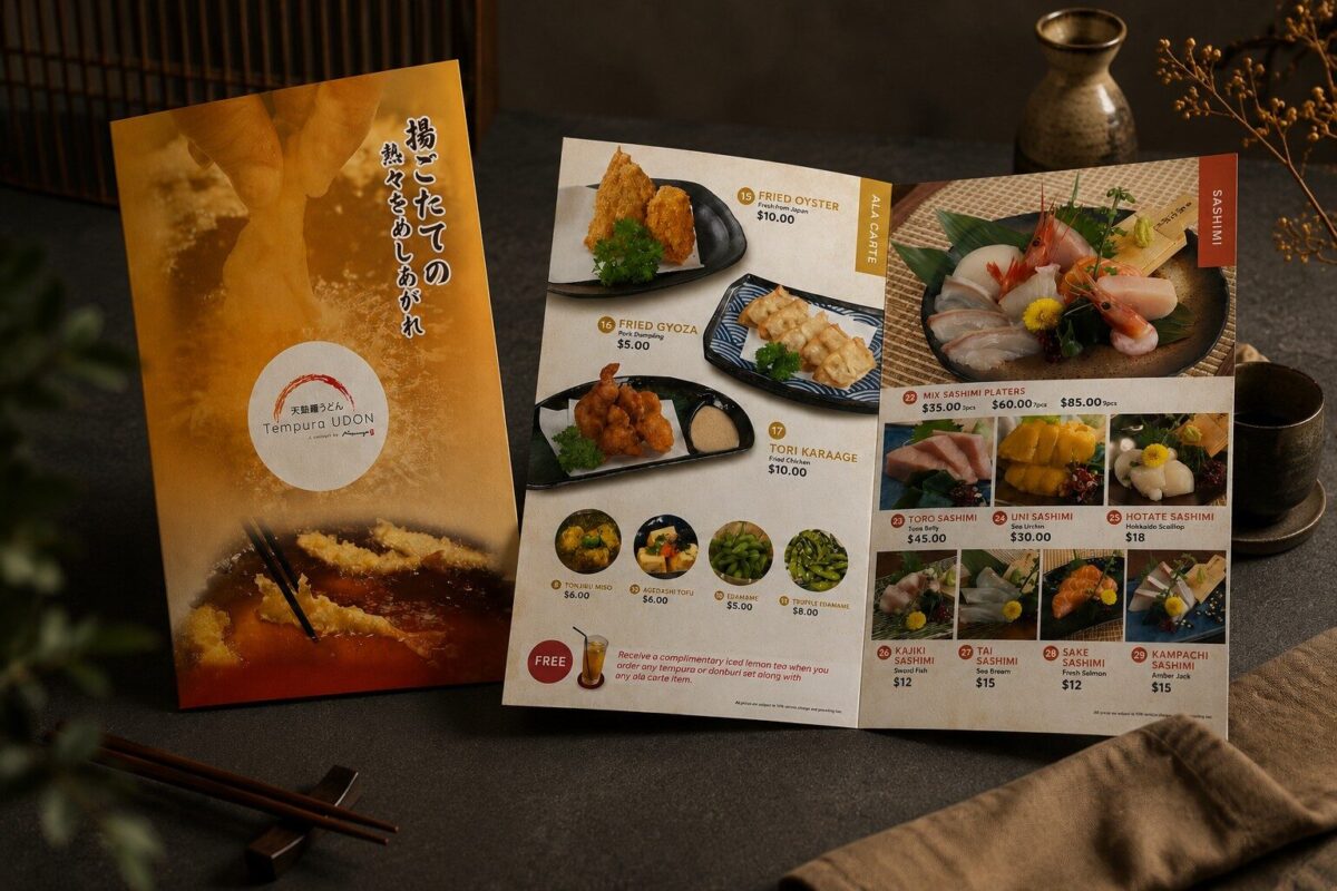
For a Japanese restaurant, you might want to feature a beautifully arranged sashimi platter, crisp tempura or a carefully presented donburi. For a café, it might be your signature brunch plate, an indulgent dessert or a drink that looks almost too good to sip.
Quality matters more than quantity
One thing I would avoid is mixing photographs that look completely different from one another.
Imagine a menu where one dish is photographed under warm, moody lighting, another has a blueish tint, and a third looks as though it was taken under the fluorescent lights of an office pantry.
Each image might be perfectly fine on its own, but together? The menu can feel a little confused.
Consistent lighting, styling, image quality and cropping help create a more cohesive result.
And if you're using photographs, make sure they represent the actual dishes. It's lovely to make food look appetising, but customers shouldn't feel they've ordered the less glamorous cousin of the dish in the photograph.
When should you use photographs?
I'd consider using images for:
- Signature dishes you want to highlight.
- Set meals and sharing platters.
- Visually distinctive dishes.
- New dishes that customers may not recognise.
- Seasonal specials or promotional items.
If you have a large menu, you can use selected photographs rather than trying to squeeze an image next to every item.
Remember, we still need room for the dish names, descriptions and prices. Unless your restaurant is planning to serve a photo album for dinner, a little balance is helpful.
6. Writing dish descriptions: make customers hungry, not sleepy
A dish description has a fairly straightforward job: tell customers what they're ordering and, when appropriate, make it sound delicious.
It doesn't need to be a dramatic piece of literature.
For example, "Grilled salmon with rice and vegetables" is clear enough. If there's something distinctive about the preparation or ingredients, we can add a little more detail.
"Grilled salmon served with steamed rice and seasonal vegetables" gives the customer a bit more information without making them read a whole paragraph.
Of course, if your salmon has a special glaze or a signature preparation, that might be worth mentioning — provided the description accurately reflects the dish.
The trick is knowing how much information is useful.
Keep it clear, consistent and appetising
I would generally recommend:
- Using clear dish names.
- Mentioning key ingredients or distinctive cooking methods.
- Keeping descriptions reasonably concise.
- Explaining unfamiliar dishes when necessary.
- Presenting dietary information accurately.
This can be particularly helpful for Japanese menus, where customers may recognise some dishes but not others.
You can retain the Japanese dish name while providing an English description underneath. That way, customers who know the dish can order confidently, while those trying it for the first time have a better idea of what to expect.
And if your brand has a more playful personality, your descriptions can reflect that, too. There's no need to make every menu sound like it was written by a formal dining committee.
Just remember that clarity comes first. We want customers to be excited about the food, not wondering what on earth they've just ordered.
7. How many pages should your restaurant menu have?
Ah, the age-old question: how much information is too much information?
I once worked with a fast-casual brand whose client wanted a menu with lots and lots of pages. They wanted to include detailed information about the dishes, their histories and even the equipment used in the restaurant.
I understood the intention. They wanted customers to appreciate the thought and effort behind the food, and there was clearly a lot about the brand they were proud of.
But I kept coming back to one question: Does someone grabbing a quick lunch really want to read a whole book before ordering their chicken rice?
Imagine popping into a fast-casual restaurant during your lunch break. You're hungry, you've got about 45 minutes before you need to get back to work, and all you want is to figure out what to eat.
Instead, you're handed a menu so thick that you start wondering whether there's a reading list at the back.
By the time you've learnt the history of the signature sauce, the origins of the cooking equipment and the chef's entire culinary philosophy, your lunch break might be over.
Okay, I'm exaggerating a little. But you get my point!
Different restaurants have different needs. At an omakase restaurant, for example, the story behind the ingredients and the chef's approach can be part of the experience. Customers may genuinely enjoy learning about each course.
But at a fast-casual restaurant? Most people want to see the options, understand what they're ordering and make a decision without needing to set aside some light reading time.
That doesn't mean you should leave out everything interesting about your brand. It just means choosing the right place for that information.
A short, appetising dish description might be all you need on the menu. Your brand story could live on your website, while behind-the-scenes content and details about your cooking process could make wonderful social media posts.
That way, customers can still discover what makes your restaurant special — without having to flip through 20 pages to find the fries.
When I'm designing a restaurant menu, I always think about how customers will actually use it. Are they sitting down for a leisurely meal? Ordering at a counter? Scanning a QR code on their phones while standing in a queue?
Because a menu isn't a school textbook, and ordering lunch shouldn't feel like an examination.
The goal is to give customers enough information to make a good choice, not so much information that they forget what they came in to eat.
Sometimes, good design means adding something beautiful. Other times, it means having the courage to take things out.
And honestly? Knowing what not to include can be just as important as knowing what to put on the page.
8. Pricing: make it easy for customers to find what they're looking for
Let's talk about prices. They're an important part of the menu, but they can sometimes become an awkward design decision.
You want the menu to look good, of course, but customers also need to know how much their meal costs. We shouldn't make them play hide-and-seek with the prices.
My advice is to keep pricing clear and consistent.
If your prices are aligned neatly, customers can scan the menu more easily. If you have several columns, make sure each price is clearly associated with the correct dish.
Also, check the hierarchy. Dish names should be easy to spot, descriptions should be readable, and prices should be easy to find without overpowering everything else.
There's no need to make every price enormous, but making them tiny and faint isn't particularly helpful either.
The right approach depends on your restaurant. A casual eatery with an extensive menu will have different needs from a fine-dining establishment offering a curated tasting experience.
And one very unglamorous but important reminder: please proofread your prices before sending the menu to print.
You'd be surprised how much stress a tiny typo can cause when it has already made its way onto hundreds of printed menus. It's much better to catch it on screen than to have an unexpected printing expense.
9. Printed menu vs digital menu: which should you choose?
These days, restaurant menus come in all sorts of formats.
You might have a traditional printed booklet, a laminated menu, a QR code menu, a wall-mounted display or a digital menu board.
Which is best? It depends on how your restaurant operates.
Printed restaurant menus
There's something lovely about a well-designed physical menu. Customers can browse it comfortably, and the choice of paper, finish and binding can contribute to the overall dining experience.
Printed menus can work particularly well for full-service restaurants, cafés and establishments where the physical details matter.
The downside? If you frequently change prices or introduce new dishes, reprinting menus can become an ongoing expense.
QR code and mobile menus
QR menus offer more flexibility when it comes to updating dishes, prices and promotions.
But please don't assume that putting your menu online automatically makes everything easier.
The design still needs to work on a phone. If the text is tiny, the navigation is confusing and customers have to tap through six different screens to find the drinks, they may not be particularly impressed.
Always check how your digital menu looks on an actual smartphone, not just on your desktop computer.
Digital menu boards
Digital menu boards can work well for cafés, takeaway counters, food courts and quick-service restaurants.
They allow you to display featured dishes, promotions and changing menus, depending on your setup.
The important thing is to make the information readable from a distance. A design that looks great up close may not work so well when customers are standing several metres away.
Can you use both?
Of course!
Some restaurants benefit from having printed menus alongside QR menus or digital displays. The formats can serve different purposes.
Whatever you choose, keep the branding consistent. Your printed menu, website and digital menu should all feel as though they belong to the same restaurant.
You don't want your printed menu to look elegant and refined while your digital version looks as though it belongs to a completely different business.
10. Using AI to Design Your Restaurant Menu: What Are the Limitations?
AI has made design more accessible than ever. You can use it to explore colour palettes, experiment with layouts, generate mood boards and visualise different styles for your restaurant. If you're opening a new restaurant or refreshing an existing menu, it's a useful way to get ideas flowing before committing to a design direction.
But there's a difference between generating an attractive menu concept and producing a professional menu that's ready for customers. Here's where things can get tricky.
AI-generated text can be unreliable
AI tools can produce beautiful-looking menus, but they may struggle with text-heavy designs. Dish names can appear misspelled, descriptions may contain gibberish, and prices or other details can be altered during image generation. These problems become more noticeable when a menu contains many items or several languages.
For restaurants, even small errors can create confusion or lead to uncomfortable conversations with customers. Any AI-generated menu content should be reviewed before publication.
A good-looking menu isn't necessarily a practical one
A menu isn't just a poster filled with food pictures and pretty fonts. It has a job to do: help customers understand their options and decide what to order.
AI can arrange dishes into an attractive composition, but it may not understand which items deserve the most attention, how customers typically scan a menu, or how to organise a large selection without making everything feel overwhelming. It might give every dish equal visual weight, bury your signature items in a corner or make important information surprisingly difficult to find.
Good menu design considers the customer's ordering experience, not just how the page looks. A visually striking design is only effective if customers can navigate it easily.
Long menus and multiple languages can be challenging
A simple one-page drinks menu is very different from a restaurant menu containing 80 dishes, several categories, detailed descriptions and translations.
As the content grows, AI-generated layouts can become inconsistent. Text sizes may vary, spacing can become uneven, and some items may be squeezed into awkward spaces. Chinese, Japanese and other non-Latin scripts can introduce additional challenges, particularly when fonts, line spacing and character rendering aren't handled properly.
You may end up with a menu that looks impressive in one section but feels cramped or inconsistent in another. Making updates can also be frustrating if the original layout wasn't designed to accommodate changes.
AI food photography may not reflect reality
AI can generate mouth-watering food images, but it can also invent garnishes, alter portion sizes or create dishes that look quite different from what your kitchen serves.
For a restaurant that wants to build trust, this matters. Customers should have a realistic idea of what they're ordering. Actual food photography is often a better choice for signature dishes, particularly when presentation is part of the restaurant's appeal.
It may not capture your restaurant's identity
AI can imitate broad visual styles, from minimalist Japanese dining to rustic Italian trattorias. However, choosing a style is only one part of building a distinctive brand.
Your menu should feel connected to your restaurant's personality, target audience, interior, food and overall dining experience. A generic design might look polished but still feel interchangeable with dozens of other restaurants.
This is also why copying a reference too literally can be problematic. A design that works beautifully for one restaurant may not suit another's menu content, brand identity or customer expectations. The goal is to understand what makes a reference effective, then adapt those ideas to your own brand.
A beautiful AI image isn't necessarily a usable design file
This is one of the most practical limitations. AI often produces a flattened image rather than a properly structured, editable menu file. That means changing a single price, replacing a dish photograph or adding a new item may require more work than expected.
Professional menu artwork also needs to account for practical production requirements, such as the correct dimensions, resolution, bleed, safe margins and colour settings for the intended printer. Digital menus have their own considerations, including readability on mobile screens and compatibility with the restaurant's ordering system.
An image that looks sharp on your laptop may not reproduce as expected when printed at full size. If your restaurant regularly changes prices or introduces seasonal specials, an easily editable file becomes especially valuable.
Human judgement still matters
AI can speed up parts of the creative process, but it doesn't replace the experience needed to make thoughtful design decisions. Someone still needs to assess readability, visual hierarchy, brand consistency and whether the finished menu works for the restaurant's customers.
It's also worth checking usage rights for AI-generated assets, fonts, photographs and reference material, particularly if the menu will be used commercially.
So, where does AI fit into the menu design process?
I'd use AI to explore creative directions, generate initial concepts, experiment with colour combinations and visualise ideas that might otherwise be difficult to communicate. It can be a useful tool for getting the creative process moving.
For the finished menu, however, I'd still want a considered layout, consistent typography and production-ready artwork. You need a design that works in the real world, not just one that looks good in a mock-up.
AI can help you imagine what your menu could look like. The real design work is turning that idea into something readable, recognisably yours and ready for your customers to use.
After all, your menu isn't just a pretty piece of paper. It's one of the most important tools your restaurant has for communicating its identity and helping customers decide what to eat.
11. Before printing: a few things worth checking
This section is much less exciting than choosing fonts and looking at food photography. But it's also the section that might save you from a very annoying phone call to your printer.
A menu can look perfect on your screen and still turn out differently when printed. That's why preparing your artwork properly matters.
Here are a few things to check.
Bleed and trim
If your design extends to the edge of the paper, you may need to include bleed so that small trimming variations don't leave unwanted white edges. Check the printer's specifications before preparing your final artwork.
Image resolution
Use images with sufficient resolution for the intended print size. A photograph that looks sharp on a small screen might appear blurry when printed larger.
Colour differences
Colours can look different on screen and on paper because of the display, colour settings, printing process and paper used. If exact colours matter to your brand, discuss the requirements with your printer.
Paper and finishing
Think about how the menu will be used. A menu handled throughout the day may need a more durable material or protective finish. A premium tasting menu might call for a different paper choice.
Proofreading
Check every dish name, description, price, contact detail and dietary note. If you're printing a bilingual menu, check both languages carefully.
Printed proof
When practical, ask for a printed proof or sample before approving a large print run. It's much easier to spot an issue when you're looking at the actual menu rather than a screen.
My biggest advice? Don't leave printing considerations until the very end. A little planning at the start can make the whole process much smoother.
12. When should you redesign your restaurant menu?
You don't necessarily need to redesign your menu every year. If it's working well and still reflects your brand, there's no need to change it simply for the sake of changing it.
But there are times when a refresh makes sense.
For example, you might want to consider a restaurant menu redesign if:
- You're opening a new outlet or rebranding your restaurant.
- Your dishes, prices or menu structure have changed significantly.
- Your existing menu is difficult to read or navigate.
- Your menu no longer reflects the quality or personality of your brand.
- Your photographs are outdated or no longer match the dishes.
- You're introducing a digital menu or a new ordering system.
- Your printed materials look inconsistent with your website and social media.
Sometimes, you only need to update a few sections. Other times, a more complete redesign is the better option.
If you're not sure, take a fresh look at your menu from the customer's perspective.
Can you find your favourite dishes easily? Are the descriptions clear? Does the menu feel like it belongs to your restaurant today?
And perhaps most importantly: does it make choosing what to eat feel enjoyable?
You don't have to tear everything up and start again. Sometimes, a few thoughtful changes can make a meaningful difference.
13. So, what actually makes a good restaurant menu?
After years of designing menus, I've learnt that good design isn't always about adding more.
Sometimes, it's about choosing the right font. Sometimes, it's about giving a signature dish more attention. And sometimes, it's about gently suggesting that perhaps we don't need another six pages of information about the restaurant's cooking equipment.
A good menu brings together a few important things:
A clear brand identity. It should feel right for your restaurant rather than looking like a copy of someone else's.
Easy navigation. Customers should be able to find what they're looking for without getting lost.
Readable typography. Beautiful fonts are wonderful, but customers still need to read them.
Thoughtful use of images. Food photography should make the dishes more appealing and support the overall design.
The right amount of information. Give customers enough detail to make informed choices without overwhelming them.
Practicality. The menu needs to work in its intended format and be manageable when prices, dishes or promotions change.
There isn't one perfect formula for every restaurant. A Japanese restaurant, a casual café and a fine-dining establishment all have different needs.
That's why I prefer to understand the restaurant first, then develop a design that suits its concept, customers and day-to-day requirements.
Because at the end of the day, the best restaurant menu isn't necessarily the fanciest, thickest or most expensive one.
It's the one that makes sense for your restaurant, looks good doing it and helps your customers decide what they're going to enjoy.
And if it manages to do all that without making anyone squint or read a novel before ordering? Even better.
Looking for restaurant menu design in Singapore?
If you're opening a new restaurant, refreshing your existing menu or trying to bring a little more consistency to your F&B brand, I'd love to hear what you're working on.
At Rei Law Design, I work with restaurants, cafés and hospitality brands on creative projects including printed restaurant menus, Japanese menus, omakase menus, digital menu boards and other marketing materials.
Depending on your needs, I can also help with related design work such as food photography, restaurant websites and promotional materials, so your brand feels consistent beyond the menu itself.
Every restaurant is different, and I don't believe in forcing every client into the same design template. I'd rather understand your concept, your customers and what you're hoping to achieve, then work towards a solution that makes sense for your business.
You can explore my restaurant menu design portfolio to see examples of my work.
Or, if you've got a menu project in mind, get in touch with me and tell me a little about your restaurant.
Whether you need a brand-new menu or simply feel that your current one could use a little love, let's talk.
Your food deserves a menu that does it justice.
Frequently Asked Questions About Restaurant Menu Design
Ready to give your restaurant menu a refresh?
Visit Rei Law Design's restaurant menu design portfolio or get in touch to discuss your project.
My final recommendations before this goes live
- Add genuine project photographs throughout the article, especially beside the Japanese typography anecdote and the sections on printed menus and food photography.
- Keep the two client stories. They're the most distinctive parts of the article and show how Rei thinks, not just what she can design.
- Check the existing service page and URL before publishing, so the article links to the correct destination and doesn't compete with an existing page targeting the same keyword.
- Add a real author byline for Rei and, if available, a short designer bio explaining her experience with F&B projects.
Let's create a better dining experience. Request a Free Consultation Today!
Let's discuss your ideas
Looking for an affordable professional creative Freelance Graphic Designer in Singapore for your next project? You're in the right place!

Singapore-based freelance graphic designer creating affordable, impactful visuals for F&B, hospitality, and lifestyle brands—helping businesses attract, engage, and stand out.
© 2026 Rei Law Design | Freelance Graphic Designer in Singapore